Introduction
In today’s mobile-driven world, smartphones are becoming the primary gateway to online purchases. Businesses that prioritize mobile commerce see higher engagement, lower bounce rates, and increased conversions. Adapting to this shift is a necessity for staying competitive.
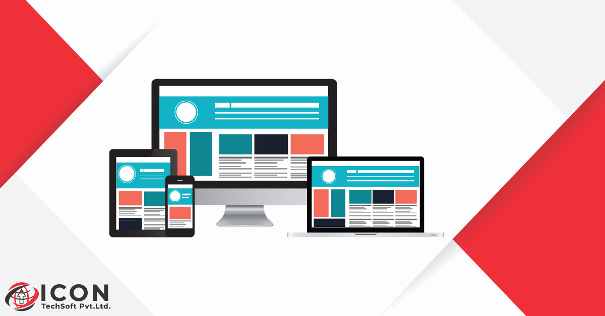
Mobile first design in eCommerce prioritizes a hassle-free, fast, and user-friendly shopping experience on smartphones before focusing on larger screens.
Ignoring mobile optimization will lead to slow load times, poor navigation, and frustrating checkout experiences, driving customers away.
According to a WebFX mobile marketing report, 61% of customers say they are more likely to buy from mobile-friendly sites. This report justifies why focusing on building a mobile-first site is important.
Continue reading to discover more about mobile ecommerce, its benefits, and how to implement mobile first design.
What is Mobile-First Design?
To understand what is mobile first design?, You also need to understand what a mobile-friendly site is.
Mobile first vs mobile friendly design. What is the difference? Mobile-first is a website design process that focuses on designing sites to work on mobile phones before planning for computers. It’s a technical approach.
A mobile-friendly design process involves adjusting an existing site for mobile. It is an intentional design approach that focuses on understanding how people interact with mobiles differently than desktops.
While a mobile first design website is always responsive, a responsive site isn’t always mobile-first.
Why Mobile-First Design is Crucial for eCommerce?
Why design mobile first websites when you can settle for a traditional website? Websites with a mobile first design can have a competitive edge in Google’s mobile-first index as listed in Google’s Ranking Factors.
According to a 2025 Hostinger research, mobile commerce is growing 29% faster than traditional eCommerce.
It is thus crucial to build a website with a mobile first design in mind. Offering easy checkout, mobile wallets, optimizing navigation, and improving speed load are a good start.
According to a study by Forbes, 53% of visitors will abandon a mobile website if it does not load under three seconds.
Keep the difference between mobile first vs responsive design in mind while designing your site. Prioritize mobile first as the majority of shoppers shop online using their smartphones. A mobile first design website will enhance the shopping experience of mobile shoppers on your site while increasing conversions.
Benefits of Mobile-First Design for eCommerce Success
1. Enhanced User Experience:
Elements such as responsive layouts, touch-friendly buttons, adaptive images, readable texts, or clear CTAs in a mobile first design enhances user experience.
2. Improves SEO:
Mobile-first website is one of Google’s ranking factors. It increases visibility and improves search rankings. In fact, Google announced that after July 5, 2024, they will not crawl and index sites that doesn’t work on mobile.
Also, according to 2024 Statista studies, 55.68% of internet searches came from mobile, whereas only 41.45% came from desktop. To allow users to find you online, a mobile-first website is thus crucial.
3. Increases Loading Speed:
Mobile ecommerce design focuses on image optimization, using proper coding techniques, and reducing the use of heavy scripts. These ensure increased loading speed.
In a LinkedIn case study of NetFrux Technologies, an e-commerce platform faced several issues including slow load times, difficult navigation, and poor UX.
They got in touch with a web designing expert who conducted research and implemented mobile-first strategies including:
- Creating grid layouts to adjust to various screen sizes
- Compressing images
- Reducing HTTP queries
- Creating intuitive navigation
- Incorporating touch-friendly buttons.
As a result, mobile traffic increased by 35% in 3 months, mobile bounce rate decreased by 20%, conversion rates increased by 25%, and they saw improved engagement.
4. Boosts Conversion Rates:
Optimized navigation, strategic CTA placement, offering mobile wallets, and easy checkouts can boost conversion rates. According to a 2025 Dynamic Yield study posed on Smart Insights, the conversion rate of mobile in e-commerce was 2.9%.
How to Implement Mobile-First Design in Your WooCommerce Store?
1. Prioritize Responsive Design:
Flexible grids and layouts adapt to different screen sizes. Use CSS media queries to adjust styles for various devices. Also, use mobile-friendly themes that automatically adjust your site’s layout based on the screen size of the device it is being viewed on.
2. Optimize Mobile Navigation:
Using a hamburger menu will give easy access to categories. In addition, implementing sticky navigation will keep the account, cart, and search buttons accessible.
Here’s an example of how Goodwill, a non-profit organization, uses sticky navigation on their website:
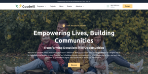
Notice the menu at the top that includes the organization’s logo, navigation items, and contact information. It enhances user experience without compromising the aesthetics.
3. Improve page load speed:
Use tools like Ewww Image Optimizer and RabbitLoader to compress images. Use WebP format. Minimize CSS and JavaScript and enable browser caching.
4. Implement a Mobile-Friendly Checkout:
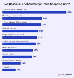
According to a 2025 SellersCommerce report, 22% of shoppers blame long/complicated checkout for abandoning online shopping carts.
Offer guest checkout to minimize friction and enable one-page checkout by giving autofill options and saved payment methods. Besides, you can offer mobile wallets like Google Pay and PayPal.
5. Leverage Progressive Web App:
Use a Progressive Web App to give users an app-like experience. It enables offline browsing, push notifications, and faster performance.
Here’s an example of an online stores that effectively uses PWA.
6. Implement Mobile SEO Best Practices:
Use a mobile-friendly URL structure, optimize for voice search, and leverage tools like SE Ranking to run a mobile-friendly site test.
7. Work with professionals:
A company that offers custom ecommerce website development services will help you build a site implementing the mobile-first best practices. You will have a more flexible and customized website and control over features.
Brands Winning with Mobile-First eCommerce
1. Walmart
- Walmart, a giant retail company invested in mobile ecommerce design and increased internet sales by 63%.
- They used complementary colors, blue and white on their website. Also, notice the orange-red shopping buttons. The design is simple yet eye-catching.
- If you visit their store, the information is presented invariably to gain attention and product search results are organized in one grid. The filtering and sorting function and predictive text input makes product search easy.
- The store’s product photos and descriptions stand out. Shipping charges, pricing, taxes, and product quantities are easily visible.
- Walmart offers easy checkout that increases conversions.
2. Rothy’s
- Rothy’s, a company that sells both men’s and women’s shoes is another example of a brand that is taking mobile first design for eCommerce to the next level.
- As soon as you visit their site, you see a carousel header featuring a colorful selection of their latest shoe style.
- The product images showcase how the shoes look when you wear them with casual outfits.
- For ease of use, they used a horizontal swipe category filter on the product listing pages.
- You’ll also notice that the customer service options such as chat and email are prominently displayed in the Homepage.
- The product information and cleaning tips on the product detail page are also readily available.
- Promotion on the Homepage is designed for trending products and fan favorites.
- All these elements give shoppers an enhanced user experience.
3. Airbnb
- Another excellent example of a company using mobile first design is Airbnb, an online company that offers homestays.
- They implemented a card design, making it easier for users to get information quickly and connect with each other from across the world.
- The information on each card is concise and effective. It usually has a title, image, graphic, or profile text.
- Users get enough information from the card to decide if they want to explore and learn more.
Tools and Resources for Mobile Optimization
1. Google PageSpeed Insights:
- Google PageSpeed Insights is a great mobile ecommerce tool. It helps you analyze your site’s performance on mobile.
- It tests load time, responsiveness, and visual stability and provides an estimated performance overview.
- The tool also compares a page’s performance to other pages and give suggestions for improvement.
2. Hotjar for Mobile User Behavior Tracking:
- Hotjar’s session recordings feature allows you to view how users navigate your site, helping you to discover areas of friction and improvement.
- Heatmaps is another feature that reveals the parts of your page customers find most engaging and areas that need improvement.
- Hotjar also offers surveys and feedback tools to track user behavior.
3. WooCommerce Plugins for Mobile UX Improvements:
- Use tools like AMP for WooCommerce to create a lightweight, fast-loading mobile version of your store.
- WP Rocket plugin can improve site speed with caching, lazy loading, and other optimizations.
- Tools such as Sticky Header Effects for Elementor makes navigation smoother by keeping headers accessible.
- For simplifying checkout, consider using WooCommerce One Page Checkout tool.
Conclusion
Implementing mobile first strategy is crucial for customer satisfaction and driving business growth. The number of mobile shoppers is on the rise and customers expect companies to offer them superior mobile shopping experience.
Mobile first design prioritizes responsive design, optimizes navigation, improves page load speed, simplifies checkout, and improves SEO, enhancing user experience.
The best time to focus on mobile ecommerce is NOW- not later.
Ready to future-proof your eCommerce business? Let’s optimize your mobile store today!
We specialize in mobile-first optimization, ensuring easy navigation, fast load times, and effortless checkout experiences. Enhance your site’s engagement, reduce bounce rates, and maximize conversions with a mobile-optimized store by collaborating with us.