
-
Gujarat, India
- info@icontechnology.in
- 24/7 Customer Support
Gujarat, India
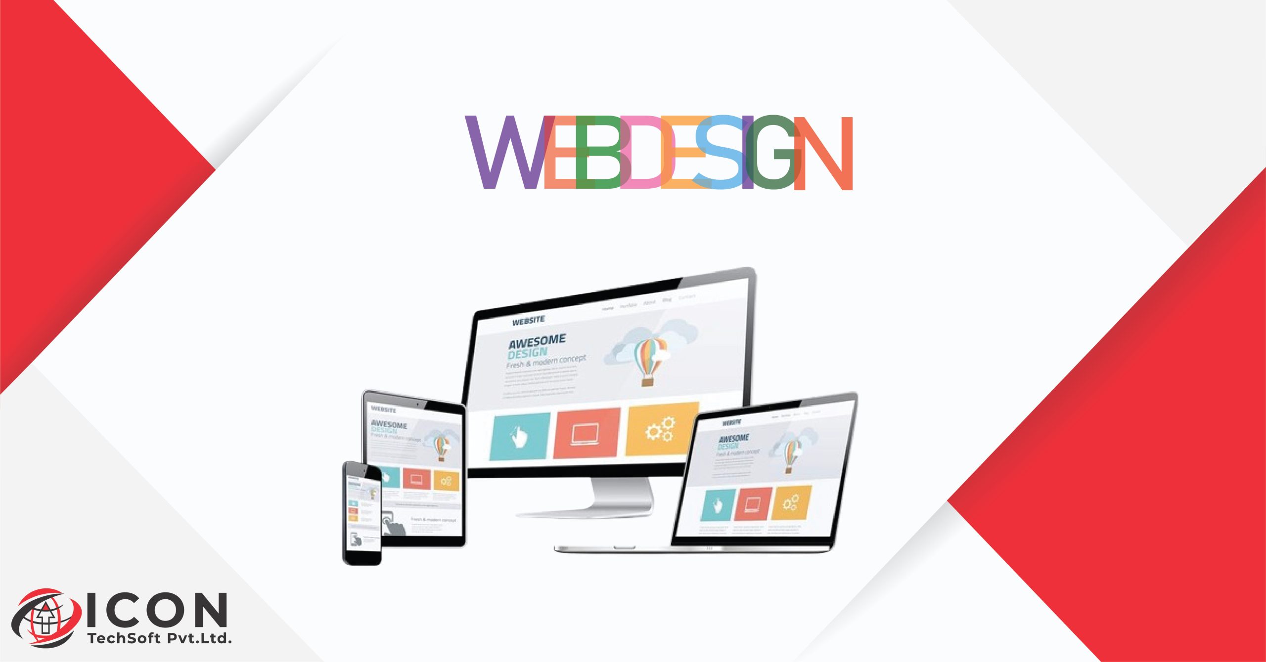
Responsive Web Design (RWD) is an essential part of modern web development. It allows websites to automatically adjust and look great on any device, whether it’s a smartphone or a desktop computer.
In 2025, knowing RWD isn’t just important – it’s crucial. With over 60% of web traffic coming from mobile devices, the success of your website depends on providing a seamless experience across all platforms. A responsive design ensures that your content is always accessible, easy to read, and engaging, no matter how users are viewing it.
This guide will walk you through 5 practical steps to mastering Responsive web design:
Each step builds on the previous one, creating a comprehensive approach to mastering responsive design. You’ll discover practical techniques, industry best practices, and proven strategies for creating websites that look and perform beautifully on any device.
Mobile-first design starts with creating your website for the smallest screen size first. This approach aligns perfectly with current user behavior – 65% of web traffic now comes from mobile devices. By prioritizing mobile design, you’re building for the majority of your users right from the start.
Here’s what mobile-first design means in practice:
Mobile-first design forces you to make critical decisions about content hierarchy and user experience early in the development process. This constraint-first approach leads to cleaner, more focused designs that work well across all devices. The limited screen space pushes you to prioritize what truly matters to your users, resulting in more efficient and effective websites.
Fluid grid systems are essential for responsive web design. They act as an unseen structure that keeps spacing and alignment consistent across different screen sizes. Instead of using fixed pixel values, these grids use percentage-based measurements, which allows content to adjust smoothly to various viewport sizes.
Understanding the Basic Structure of Fluid Grids
A basic fluid grid structure includes:
Here’s a practical example of fluid grid CSS:
css .container { width: 100%; max-width: 1200px; }
.column { float: left; width: 33.33%; padding: 15px; }
Going Beyond with Flexible Layouts
Flexible layouts take fluid grids a step further by intelligently repositioning elements based on available space. You can achieve this through:
These flexible layout techniques enable:
Leveraging Modern CSS Frameworks
Modern CSS frameworks like Bootstrap and Foundation implement these principles out of the box, providing pre-built grid systems that speed up development while maintaining flexibility for custom designs.
Media queries act as your responsive design’s control center, allowing you to create tailored experiences across different screen sizes. These CSS rules detect device characteristics and apply specific styles accordingly.
Essential Breakpoints for 2025:
Here’s a practical example of media query implementation:
css /* Base styles for mobile */ .container { width: 100%; padding: 15px; }
/* Tablet styles */ @media screen and (min-width: 481px) { .container { width: 90%; padding: 20px; } }
/* Desktop styles */ @media screen and (min-width: 1025px) { .container { width: 80%; padding: 30px; } }
Best Practices for Media Queries:
Your media queries should focus on creating smooth transitions between layouts. Watch for content shifts, navigation changes, and typography adjustments at each breakpoint to maintain visual harmony across all screen sizes.
Images and typography are essential for creating visually appealing responsive websites. Let’s explore proven techniques to optimize these elements for seamless viewing across devices.
Flexible Images
To create responsive images, you need to use a combination of CSS properties and HTML attributes:
css img { max-width: 100%; height: auto; }
This simple CSS rule ensures that images scale proportionally within their containers. If you have art-directed images, you can use the picture element:
html
Image Compression Techniques
To optimize your images, you can use the following methods:
Responsive Typography
To implement fluid typography, you can use viewport units:
css :root { font-size: calc(16px + 0.5vw); }
h1 { font-size: clamp(2rem, 5vw, 4rem); }
Make sure to use relative units (em/rem) for font sizes and line heights to maintain readability across different screen sizes. Additionally, set appropriate font-size ranges using the clamp() function to prevent text from becoming too large or small.
Creating an inclusive website means designing navigation systems that work seamlessly for every user. The key lies in implementing scalable navigation that adapts to different screen sizes while maintaining usability.
Your navigation elements need specific dimensions to ensure optimal touch interaction:
Accessibility features transform your responsive design into an inclusive experience:
Your mobile menu should adapt intelligently:
Testing your navigation across different devices helps identify potential accessibility issues. Use automated tools like WAVE or aXe to check compliance with accessibility standards, but remember that manual testing provides valuable insights into real-world usability.
Testing responsive designs requires a systematic approach across multiple devices and browsers. Here’s a practical testing strategy for 2025:
Essential Testing Checklist:
Common Issues to Watch For:
Recommended Testing Tools:
A robust testing process includes checking your site’s behavior when users resize their browser windows. Pay special attention to how advertisements adapt to different screen sizes – they often cause layout shifts and can disrupt the user experience. Consider implementing lazy loading for better performance and test how this affects your site’s responsiveness across different connection speeds.
Responsive and adaptive design represent two distinct approaches to creating device-friendly websites. Here’s what sets them apart:
Responsive Design:
Adaptive Design:
While responsive design offers seamless scaling across all devices, adaptive design provides more control over specific device experiences. Responsive design typically requires less maintenance but demands careful planning for fluid transitions. Adaptive design excels in situations requiring highly optimized experiences for specific devices but needs more upfront development time.
Mastering responsive web design unlocks significant advantages for your digital presence:
Enhanced User Experience
SEO Performance Boost
Brand Impact
Cost-Effective Development
Mastering responsive web design makes you a flexible web developer ready for the digital world of 2025. The five-step approach – mobile-first mentality, fluid grids, media queries, optimized assets, and enhanced navigation – creates websites that work perfectly on any device.
These web design strategies prepare you to:
Start using these responsive web design best practices today. Your ability to create adaptable, user-friendly websites will be invaluable as mobile usage continues to dominate the digital space.