-
Gujarat, India
- info@icontechnology.in
- 24/7 Customer Support
Gujarat, India
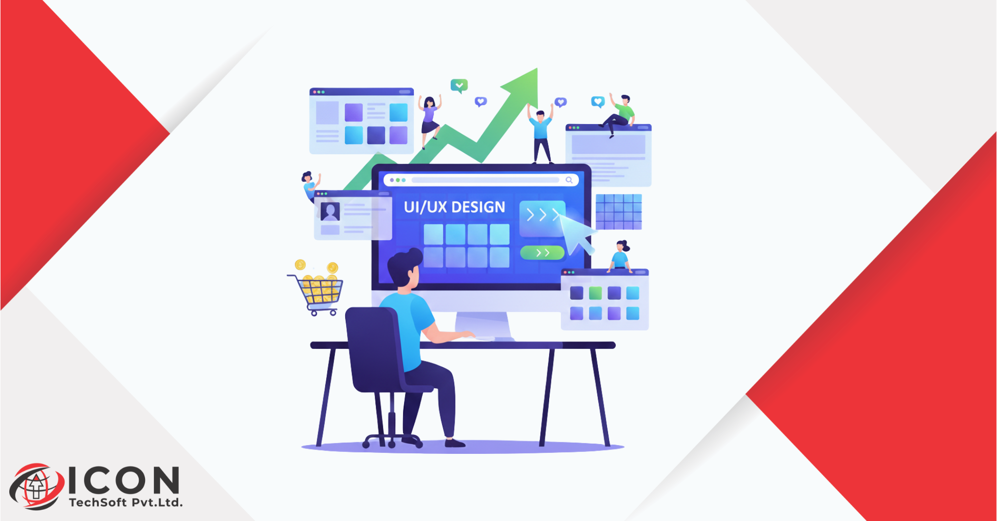
In 2025, digital experiences decide whether a business thrives or fades. UI/UX design has evolved far beyond aesthetics – it’s now the core of how customers interact, decide, and convert.
Years ago, businesses could get away with visually appealing but hard-to-navigate websites. Today’s users don’t tolerate that. They want clarity, speed, and connection. Whether they’re shopping, booking a service, or using an app, users expect effortless navigation and emotional comfort.
A report by Forrester found that a well-designed user interface could raise conversion rates by up to 200%, and better UX design could yield conversion rates up to 400%. That’s the difference between a curious visitor and a loyal buyer.
Good UI/UX web design does three things:
In short, UI/UX design isn’t about pixels – it’s about people.
To understand how UI/UX design boosts conversions, let’s break it down:
Imagine visiting an online store with messy menus, unclear CTAs, and inconsistent layouts. Even if the product is great, the frustration makes you leave. Now compare that to a smooth website where products are categorized clearly, checkout takes seconds, and visuals align with brand tone – that’s great UX in action.
Businesses with strong UI/UX workflows enjoy:-
Online UI/UX design ensures your digital product connects emotionally and functionally – helping users trust your brand before they even purchase.
Behind every conversion lies psychology. Good UI/UX design leverages behavioral science – understanding how users think, decide, and act.
Humans read visuals before words. Designers use size, contrast, and placement to guide attention. Headlines, images, and buttons are placed in a sequence that leads the user toward a goal – like subscribing or purchasing.
Color affects mood and behavior:
A well-crafted ui ux web design uses color to drive subtle emotional cues that encourage engagement.
When users are overwhelmed, they quit. Reducing unnecessary steps and decluttering layouts helps users make decisions faster – which is key to conversion.
Familiar patterns feel safe. Navigation that mirrors common web habits (like hamburger menus or consistent CTAs) prevents friction. Users shouldn’t have to “learn” your website.
Pro Tip: Simplicity doesn’t mean boring – it means intentional. Every design choice should help users move forward effortlessly.
Bad design costs real money.
If a site is confusing, users leave – often forever. Here’s what typically goes wrong:
When users can’t find what they need within 3 clicks, they bounce.
Example: A travel company once buried its “Book Now” button inside dropdown menus – after repositioning it prominently, bookings increased by 35%.
Every second delay reduces conversions by 7%. Speed optimization is one of the simplest ways to improve ui ux user experience.
Buttons like “Submit” or “Click Here” don’t inspire action.
Instead, use phrases like “Get My Quote” or “Start My Free Trial.”
A mismatch between visuals and tone breaks trust. Imagine seeing a luxury product on a cluttered, cartoonish page – it instantly feels unreliable.
Case Example:
A SaaS brand redesigned its cluttered dashboard into a minimalist interface. The result? 40% higher user retention and double the conversion rate within two months.
Users shouldn’t think twice. Clean layouts, clear CTAs, and structured content make journeys predictable – which users love.
Visual uniformity builds subconscious trust. Fonts, button styles, and tone should feel identical across pages.
Good design works for everyone – including users with disabilities.
Use sufficient contrast, alt text, and scalable typography.
Your design must adapt seamlessly across mobile, tablet, and desktop. Mobile-first UI/UX workflows are essential in 2025.
Even the most beautiful interface fails if it’s slow. Optimize images, reduce scripts, and test regularly.
Remember: Performance is part of design. Fast experiences convert better.
The UX journey maps perfectly to the marketing funnel.
A strong ui ux workflow aligns with each of these stages, ensuring no user gets lost mid-journey.
Each page should have one clear goal. Remove extra links and distractions. Use hierarchy:
Headline → Visual → Value Proposition → CTA.
The best CTAs are visible, concise, and emotionally charged.
Example: “Join 10,000+ Marketers Already Growing With Us.”
Modern online UI/UX design uses behavior-based customization. For example, showing recommended products or location-based offers can increase conversion by up to 26%.
Small animations when users click or hover make digital experiences more “alive.” They confirm user actions, reducing uncertainty.
Every extra field in a form reduces completions by 10%. Keep it short and smooth.
Trust determines conversion.
Add security badges, payment options, testimonials, and reviews near CTAs. These small cues reduce hesitation.
Show policies clearly. Be upfront about shipping costs or cancellation terms – users value honesty more than perfection.
Highlight ratings, client logos, or real testimonials. People trust experiences from people like them.
Example: Adding “Trusted by 1,000+ brands” near a signup form increased conversions by 22%.
Mobile users are impatient. If your mobile site isn’t responsive or loads slowly, they’ll leave instantly.
Brands like Uber, Swiggy, and Zomato thrive because their UI/UX web design is built for one-handed use – fast, simple, and intuitive.
UI/UX isn’t subjective – it’s measurable.
Use A/B testing, heatmaps, and analytics to find bottlenecks. A single change – like repositioning a CTA – can raise conversions by 15–30%.
Case Study:
A fintech startup simplified its onboarding process, cutting steps from six to three. Result? Conversion increased by 48%.
UI/UX and marketing are inseparable.
A strong ui ux workflow bridges the gap between traffic and conversion – turning attention into action.
Avoid these frequent pitfalls:
User-centered design means data first, opinion second.
After decluttering navigation and speeding up checkout, a fashion retailer increased conversions by 34%.
Simplifying onboarding screens helped a CRM platform reduce drop-offs by 52%.
A fitness app redesigned its home screen to emphasize goals – user retention jumped 27% in 3 months.
The next era of UI/UX design will be intelligent, ethical, and hyper-personalized.
The businesses that win will treat UX not as a trend – but as a growth engine.
Great ui ux design doesn’t push users – it guides them.
Every color, layout, and word should serve one mission: make the user’s journey effortless.
When users feel understood, they trust you. When they trust you, they buy.
So don’t just design to look good – design to convert.
Because in today’s digital world, experience is the new currency.
Q1. What’s the ROI of improving UI/UX?
Every $1 invested in UX returns up to $100 in profit.
Q2. How often should I redesign my site?
Every 2-3 years, or when analytics show behavioral shifts.
Q3. What’s more important – visuals or usability?
Usability. A simple but usable design always beats a fancy one that confuses users.
Q4. How do I know if my UX is working?
Monitor engagement, conversion, and retention metrics.
Our expert team crafts conversion-focused UI/UX web designs that connect business goals with human needs.
We build experiences that don’t just attract clicks – they inspire loyalty. Explore Now UI/UX Design Company