-
Hetal V.
-
15-10-2025
-
0 comments
The Future of Website Design: From Menus to Voice Search
Introduction
Website design has always been more than aesthetics. While colors, typography, and layout matter, the core of a website’s success often comes down to how easily users can navigate it. Website navigation is the backbone of web design, allowing visitors to explore pages, find information, and complete actions like purchases or sign-ups without frustration.
In the early days of the web, navigation was simple:- top menus, sidebars, and links. As websites grew more complex, designers faced the challenge of organizing hundreds or thousands of pages into intuitive structures. Poor navigation could frustrate users, increase bounce rates, and hurt conversions, regardless of how visually appealing a site was.
Today, we are witnessing a major shift in web design philosophy. With the rise of mobile devices, voice search, and AI-powered tools, traditional menus are no longer the only way users interact with websites. Visitors now expect faster, smarter, and more personalized navigation experiences.
In this blog, we’ll explore:-
- What website navigation is and why it matters
- The types of navigation used in modern websites
- Why better navigation improves user experience, SEO, and conversions
- What today’s users expect from website navigation
- How voice search is changing web interactions
- Practical tips to future-proof your website navigation
We’ll also include examples of website navigation done right, so you can see real-world applications of these trends. By the end, you’ll have a clear understanding of how to design navigation for the modern web.
What Is Website Navigation?
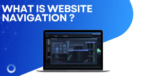
Website navigation is the system that guides users through your website. It’s like a roadmap, helping visitors find content, products, or information efficiently. Without proper navigation, users may feel lost, frustrated, or leave your site entirely.
Types of Website Navigation
Modern websites use various types of navigation to enhance usability. Here are the most common:
- Top Menu Navigation:
- Located at the top of a webpage, often horizontally.
- Includes primary sections like Home, About, Services, Blog, and Contact.
- Works well for desktop and responsive mobile designs.
- Sidebar Navigation:
- Vertical menus on the side of pages.
- Common for blogs, dashboards, and e-commerce sites.
- Allows deeper category exploration without cluttering the main interface.
- Breadcrumb Navigation:
- Displays the user’s path through the site.
- Enhances user orientation and makes backtracking easier.
- Improves SEO by clarifying site structure for search engines.
- Footer Navigation:
- Menus at the bottom of the page.
- Contains important links like Terms, Privacy, Careers, and Contact.
- Provides a secondary navigation system.
- Hamburger / Hidden Menus:
- Compact menus used mainly for mobile.
- Expand on click, keeping the interface clean.
- Mega Menus:
- Large dropdown menus showing multiple categories at once.
- Useful for e-commerce sites or content-heavy platforms.
- Search-Based Navigation:
- Allows users to type queries and find pages instantly.
- Especially important for sites with vast content or products.
- Interactive / Card-Based Navigation:
- Uses visual cards or tiles as clickable navigation options.
- Great for portfolios, galleries, or modern app-like experiences.
Importance of Intuitive Navigation in website design
Intuitive navigation ensures users:
- Find information in 3 clicks or fewer
- Understand the website structure without effort
- Feel confident and trust the brand
- Explore additional content rather than leaving the site
A poorly structured website can make even the most visually stunning design fail. That’s why web design is not just about aesthetics- it’s about usability, clarity, and guiding users to their goals efficiently.
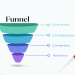
Why Better Navigation Is Important
Navigation and User Experience
Good navigation directly impacts the user experience:
- Time on Site:- Users stay longer when they can find what they need quickly.
- Conversions:- Easy navigation leads to higher sales, newsletter sign-ups, or inquiries.
- Engagement:- Users are more likely to explore multiple pages.
- Brand Reputation:- Confusing navigation can make a brand appear unprofessional.
Conversely, poor navigation leads to frustration, abandonment, and negative perceptions. In e-commerce, studies show that users leave 50% of the time if a website is difficult to navigate.
Role of Navigation in SEO
Navigation isn’t just for users; it’s critical for search engines:
- Crawlability:- Search engines use navigation to discover and index pages.
- Internal Linking:- Proper menus distribute link equity across important pages.
- Bounce Rate Reduction:- Easy navigation keeps users engaged, which signals quality to search engines.
- Structured Hierarchy:– Clear navigation communicates the importance and relationship between pages.
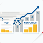
Examples of Good vs. Poor website design Navigation
Good Navigation Examples:
- Amazon:- Top menu, search bar, filters, and breadcrumbs make finding products seamless.
- Apple:- Clean top menu, interactive mega menus, and clear category labels.
Poor Navigation Examples:
- Overloaded menus with unclear labels.
- Hidden content without links or search options.
- Websites forcing multiple unnecessary clicks to reach important content.
By studying these examples, designers can understand how web navigation directly affects user satisfaction and business performance.
What Today’s Users Expect in an Effective Website Design
Modern users are impatient and have high expectations:
Fast, Seamless, and Mobile-First Navigation
- Mobile traffic continues to grow, and websites must prioritize responsive design.
- Navigation must be touch-friendly with clear, tappable areas.
- Fast-loading menus prevent bounce and frustration.
Personalization and Context-Aware Experiences
- Users expect content relevant to them, based on location, behavior, or preferences.
- Personalized menus can highlight recommended products or services.
- Context-aware navigation adapts dynamically based on user actions.
Real-Life Expectations
- Quick search bars for instant access.
- Minimal clicks to reach key content.
- Clear, concise labels to avoid confusion.
- Optional voice commands for hands-free interaction.
Meeting these expectations ensures users stay engaged and return to your site.
About Voice Search in website design
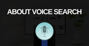
What Is Voice Search?
Voice search allows users to speak queries instead of typing. It is powered by natural language processing, enabling websites to interpret and respond accurately.
Devices and Platforms Supporting Voice Search
- Amazon Alexa:- Smart speakers and home assistants.
- Google Assistant:- Smartphones, smart displays, and speakers.
- Apple Siri:- iPhone, iPad, Mac, and HomePod.
- Microsoft Cortana:- Windows devices and productivity tools.
Why Voice Search Is Becoming Part of Website Design
- Faster interaction for mobile users.
- More natural and convenient than typing on small screens.
- Requires websites to structure content for conversational queries.
Voice search is reshaping web design, making voice-friendly headings, FAQ pages, and Q&A content essential.
Tips for Your Future Website Design
Use Clear Labels and Smart Categorization
- Avoid jargon and vague terms.
- Use categories users naturally expect.
- Group similar content together for logical flow.
Implement Voice-Friendly Content
- Create content in Q&A format for easy voice query responses.
- Use natural language in headings and paragraphs.
- Optimize long-tail keywords reflecting how users speak.
Improve in website design – Mobile Navigation and Speed
- Make menus responsive and touch-friendly.
- Prioritize fast-loading pages and compressed images.
- Test navigation across multiple devices and screen sizes.
Consider AI-Powered Search or Chatbot Support
- Guide users quickly to desired content.
- Answer frequently asked questions without manual intervention.
- Provide an additional navigation layer beyond traditional menus.
Monitor and Adjust Continuously
- Use analytics to track clicks, search queries, and bounce rates.
- Identify navigation pain points and optimize accordingly.
- A/B test menu structures and search layouts for maximum usability.
Final Thoughts – Website Design
The future of web design is moving from static menus to dynamic, voice-enabled, and AI-powered navigation experiences. Businesses that embrace these changes will provide superior user experiences, increase engagement, and boost conversions.
Auditing your website navigation today can reveal hidden friction points. Ask yourself:
- Can users reach important pages in three clicks or fewer?
- Is your site mobile-friendly and fast?
- Are your menus voice-search ready?
- Does your navigation support personalization and context-aware experiences?
By taking action now, you can create websites that are not only visually appealing but also intuitive, engaging, and future-proof. Remember, website navigation is more than moving from page to page- it’s about creating a seamless journey that guides users, builds trust, and drives results.
Stay ahead of trends, adopt voice search, and ensure your web design serves your users as effectively as possible. The future is here-your website navigation should be ready.