
-
Gujarat, India
- info@icontechnology.in
- 24/7 Customer Support
Gujarat, India
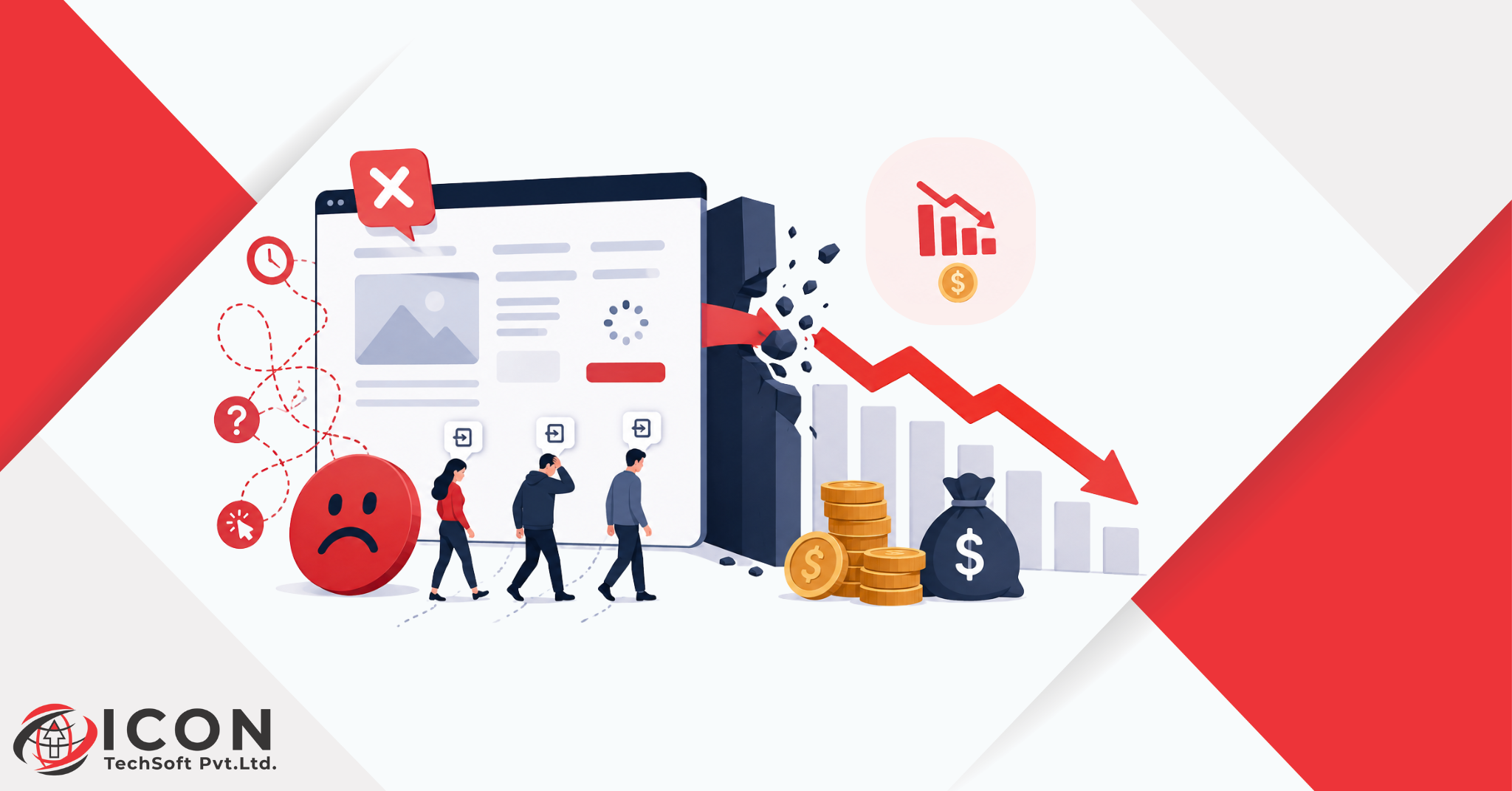
Here’s something I’ve noticed working with businesses across different industries: owners will spend hours arguing over ad copy or a five-rupee price change, but almost never look at their own website the way a stranger would. And that’s a problem. Because there’s a quiet cost sitting right there on the site, bleeding money out slowly, and almost nobody checks for it. It’s called UX.
Bad UX doesn’t send you a warning. No alert pops up saying “hey, you just lost a customer because your menu is confusing.” It just happens. Over and over. Visitors show up, get frustrated, and leave, and because none of that shows up neatly in a spreadsheet, owners usually blame something else. The ad targeting. The pricing. The competition. Rarely the site itself.
So let’s actually talk numbers here. What does bad UX cost a business, in real terms? How badly does it hurt conversion rate? And what can you actually do about it, without blowing your entire budget on a redesign?
UX, short for user experience, is basically how someone feels while they’re using your website or app. Good UX is invisible, you don’t notice it because everything just works. Bad UX is the opposite. It’s the moment someone pauses and thinks, “wait, how do I even do this?”
And honestly, bad UX is rarely one big dramatic failure. It’s usually death by a thousand cuts. A page that takes an extra three seconds to load. A menu with way too many options crammed in. A checkout form that asks for your date of birth just to buy a t-shirt (why though?). None of these things feel like a huge deal on their own. Stack five or six of them together, though, and that’s enough to make someone close the tab and never come back.
Here’s the part that stings, visitors don’t tell you what went wrong. They don’t send an angry email explaining the confusing navigation. They just leave. Quietly. And go buy from whoever made it two clicks easier.
That’s really the whole point of UX design. Not how pretty the site looks in a portfolio screenshot, but whether real people can get what they came for without a fight.
A mistake I see a lot: business owners treating UX and visual design as the same thing. Site looks modern, has nice fonts, decent colors, done, right?
Not really.
UX covers the whole journey. Page speed. How obvious the navigation is. Whether the content actually answers the question someone came in with. How painless (or painful) it is to actually buy something or fill out a form.
You can have a genuinely gorgeous website that’s still miserable to use. Text too small to read comfortably. Buttons that don’t register properly on a phone screen. A five-step checkout process when two steps would’ve done the job. All of that can exist right alongside beautiful design, I’ve seen it happen more times than I can count.
Good UX design puts function before decoration. It asks the blunt questions: Can people actually find what they need? Can they finish the task without wanting to throw their phone across the room? Do they trust this enough to type in their card number?
When the honest answer is “not really”, your business is losing revenue right now, quietly, probably without you even knowing it.
Bad UX almost never shows up as one obvious hit. It’s more like several small leaks happening at once, each one small enough to ignore, but together they add up to something painful.
Every visitor who bounces without doing anything, that’s money you already spent to get them there, gone. A confusing or slow site keeps people from sticking around long enough to convert. That drags your conversion rate down, plain and simple.
For online stores, this is probably the most visible symptom of bad UX. Complicated checkout flows. Shipping charges that suddenly appear at the last step (nobody likes surprises here). Too many required fields. All of it pushes shoppers toward the “leave cart, close tab” button. This one’s measurable, too, you can literally watch it happen in your analytics.
Someone’s trying to fill out your contact form, gets stuck, gives up. That’s a person who was already interested, already halfway convinced, and you lost them anyway because the form asked for too much or the button was hiding somewhere weird.
When a website or app doesn’t explain itself well, people go straight to support instead. More tickets, calls, time spent answering the same “where’s my order” question that a clearer checkout page could’ve handled without any human involved at all.
Even a customer who buys once might not come back if the whole thing felt like a chore. A clunky app pushes people toward a competitor that made things easier. And since keeping an existing customer costs way less than winning a new one, this might honestly be the most expensive item on this whole list.
Trust takes ages to build and about ten seconds to lose. A slow, outdated, or confusing website makes people wonder, even if they can’t quite say why, whether the business behind it is actually legit. Doesn’t matter how good the product is. Bad UX makes the whole brand feel a little less trustworthy.
This is where UX conversion turns from a vague idea into a very real number. Conversion rate is just the percentage of visitors who do the thing you want, buy, sign up, fill out a form, whatever your goal is.
Bad UX tanks that number. And once it does, your marketing budget has to work twice as hard just to hit the same sales target. Every rupee spent on ads or SEO basically gets diluted by a site that can’t close the deal once people actually arrive.
Picture two nearly identical sites, same amount of traffic. One loads fast, has obvious navigation, checkout in two clicks. The other’s sluggish, cluttered, a pain to use on mobile. Which one do you think converts better? Doesn’t matter if the products are equally good, the experience decides the outcome.
That’s really the value in fixing UX conversion. You don’t need more traffic to grow. You need to stop wasting the traffic you’re already paying for.
Customer acquisition cost, CAC, is what it costs to land one new customer. And bad UX quietly pushes this number up more than most people realize.
Here’s the logic, simplified: if your site converts poorly, you need more visitors to hit the same sales number. More visitors means more spent on ads, more spent on SEO, more of everything just to stay in place. Your cost per customer climbs, sometimes without anyone noticing why.
Businesses with solid UX get more out of the exact same traffic. Fewer visitors needed to hit the same numbers, which naturally brings acquisition costs down.
Honestly, this is one of the clearest examples of UX business impact you’ll find anywhere. It’s not some fuzzy, feel-good metric buried in a design report. It shows up directly in how efficiently your marketing money actually performs.
E-commerce brands feel this pain fastest, because there’s no salesperson standing there smoothing things over when a customer gets confused. The website has to carry the entire sale, start to finish, on its own.
Cluttered product pages. Images that take forever to load. A checkout that feels sketchy or drags on too long. All of it drives shoppers away before they finish buying. Pretty much every piece of e-commerce research points to the same pattern, a huge chunk of abandoned purchases happen simply because the site was too much of a hassle.
Mobile makes it worse. With so much shopping happening on phones these days, a store that isn’t properly optimized for mobile is straight-up leaving money on the table. Tiny buttons. Slow load times. Forms that are annoying to fill out with your thumb. These turn away mobile shoppers almost instantly, and there’s a lot of them.
For e-commerce specifically, UX isn’t optional polish. It’s tied directly to revenue, full stop.
Let’s get concrete. Here are the UX mistakes that quietly drain money, over and over, without anyone flagging them.
Can’t find what you need in a few clicks? You leave. Overloaded menus, vague labels, too many choices thrown at you at once, all of it adds friction, and friction pushes bounce rates up.
Every extra field on a form is one more excuse for someone to abandon it halfway through. Long forms asking unnecessary questions absolutely kill completion rates.
A huge chunk of your traffic is on a phone right now, reading this on their commute, probably. Small text, buttons that are hard to tap accurately, slow mobile load times, these aren’t minor annoyances anymore. They’re dealbreakers.
People are impatient, has anyone ever waited happily for a slow site to load? A couple extra seconds is enough to lose someone, and it hurts your search rankings on top of that.
If people don’t know what to do next, they simply won’t do anything at all. A hidden or vague CTA is a wasted opportunity, on literally every page it appears.
Missing pricing. Unclear shipping details. Vague return policies. All of it creates hesitation, and hesitant visitors almost never convert.
Fonts and colors shifting from page to page makes a site feel sloppy, unfinished, half-built even. Consistency builds the kind of familiarity that makes people comfortable enough to actually act.
A lot of owners assume this can’t really be measured. It can, and honestly the math’s simpler than most people expect.
Start with your current conversion rate and average order value. Then figure out a realistic improved conversion rate, based on A/B tests or benchmarks from similar businesses in your space. Multiply that gap by your average order value, and you’ve got a rough figure for the revenue currently slipping through the cracks.
Quick example: 10,000 visitors a month, 1% conversion rate, that’s 100 sales. Push that to 2% through better UX, and you’ve doubled sales without spending a single extra rupee on traffic. That gap right there is basically your UX ROI.
Keeping an eye on bounce rate, cart abandonment, and time-on-page will also point you toward exactly where the money’s leaking.
The gap between bad UX and good UX shows up nearly everywhere. Bad UX brings high bounce rates, weak conversions, more abandoned carts, heavier support loads, customers who don’t stick around long-term.
Flip to good UX and the picture shifts fast. Visitors stay longer. Trust builds naturally, without you forcing it. More of them actually follow through on a purchase or signup. Support tickets drop because people can figure things out on their own. Repeat purchases climb because the whole thing just feels smoother, easier, less like work.
This isn’t cosmetic. Moving from bad UX to good UX changes real outcomes, revenue, retention, how efficiently your marketing budget performs.
Solid UX design supports growth in some pretty concrete ways. It lifts conversion rates by stripping out friction from the path to action. Builds trust through an experience that feels smooth and professional. Cuts support costs because people aren’t constantly stuck asking for help.
Helps retention too, people come back to things that are actually pleasant to use, and they tell others about it, often without you asking them to. That’s compounding value you just don’t get from a single sale.
In crowded markets, UX often becomes the tiebreaker. Similar product, similar price, the business with the smoother experience usually wins the customer.
Catch these problems early, and they’re cheap. Let them sit, and they get expensive fast. Some practical ways to spot trouble before it costs you real money:
Catching these while they’re still small saves you from much bigger losses later.
You don’t need a full redesign to make a real dent here. Most of the fix comes from small, targeted changes:
None of this needs a massive budget. It needs someone to actually go looking for the friction and remove it.
Not every UX issue needs a full overhaul, but a few signs point pretty clearly toward one. A conversion rate that’s been sliding for months. Recurring complaints about usability. A site that just looks dated next to competitors, you know the feeling when you land on one of those.
Growth is another trigger. If the business has expanded a lot since the site was first built, chances are the site hasn’t kept up with everything you now offer.
Don’t make this a gut call, though. Look at the analytics, listen to actual user feedback, track conversion trends before committing to a redesign.
The payoff from better UX usually stretches well past whatever it cost to fix in the first place. Higher conversions mean more revenue from traffic you’re already paying for. Fewer abandoned carts mean more finished purchases. Lower support costs free up time and money for other parts of the business.
There’s a slower, longer effect too, good UX builds brand reputation over time. Happy customers return, tell other people, trust you with future purchases without needing to be convinced again. That kind of loyalty compounds in a way ad spend just can’t replicate.
Look closely at UX ROI and you’ll usually find even small usability fixes translate into noticeably better revenue and happier customers, months down the line.
Bad UX rarely gets blamed for lost revenue, even though it’s often the actual cause. It doesn’t show up as a line item on any invoice, but you can see its fingerprints everywhere, if you know where to look. Lower conversions. Higher acquisition costs. Customers who quietly stop coming back.
Investing in good UX design isn’t really about making a website prettier. It’s about building something people trust enough to actually act on, turning visitors into customers, and customers into people who keep coming back. Once you see the real numbers behind bad UX, fixing it stops looking like a design project and starts looking like one of the smartest financial calls a business can make.
What is bad UX?
Bad UX means a frustrating experience on a website, app, or product, confusing navigation, slow load times, overcomplicated forms, or unclear information that makes it hard for people to actually get things done.
How does bad UX affect a business?
It lowers conversion rates, increases cart abandonment, drives up support costs, and hurts customer retention. Over time, it chips away at brand trust too.
How does poor UX affect conversion rates?
It adds friction to every step someone takes toward buying or signing up. Fewer people follow through as a result, and the conversion rate drops.
Can bad UX reduce sales?
Yes, pretty directly. If people struggle to navigate a site or push through checkout, most will just leave rather than fight it out, no matter how good the actual product is.
How much does a UX redesign cost?
Depends on the size of the site and how much work is actually needed. Small fixes can be quite affordable. A full redesign involving research, design, and development is naturally a bigger investment.
How can businesses measure UX ROI?
Compare conversion rates, bounce rates, and retention before and after UX improvements, then track how revenue shifts from the same amount of traffic. That gap is basically your UX ROI, sitting right there in the data.