-
Gujarat, India
- info@icontechnology.in
- 24/7 Customer Support
Gujarat, India
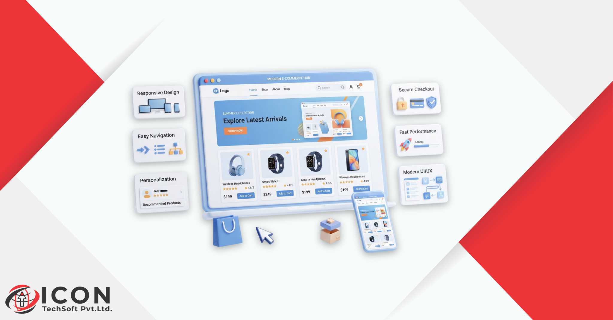
Three seconds. Maybe four. That’s roughly how long you have before a visitor decides whether your online store is worth their time. So yeah, e-commerce design matters, probably more than most people running a store actually think about day to day. A site that’s put together well makes people trust it almost instantly. A site that isn’t? People notice that too, fast, and they leave.
There’s a lot of e-commerce design inspiration floating around online, and honestly, most of it isn’t about copying anyone. It’s about paying attention to what other stores get right, then figuring out how that applies to your own products and your own customers. If you’re building a store from scratch, or trying to fix one that just isn’t converting, looking at solid e-commerce website design examples beats staring at a blank page and hoping something comes to you.
Think about it this way. Every store online is fighting for the same limited thing, a shopper’s attention span. There’s no shortage of websites to choose from, and nobody sticks around for a site that feels slow or cluttered or confusing. That’s really the whole point of design inspiration, it gives you ideas that have already been tested out there in the real world instead of leaving you to guess and hope.
So here’s what we’ll cover: 15 of the best e-commerce website design inspirations around right now, what actually separates a good design from a mediocre one, and some practical ideas you can borrow for your own store. We’ll also get into where e-commerce design is headed, the mistakes that quietly cost stores sales, and how all this design stuff connects back to actual conversions.
Before we get to specific examples, let’s break down the fundamentals. These show up again and again in stores that actually sell.
Clutter is the enemy here. A clean layout clears out the noise so shoppers can focus on the products, not on fighting through banners and pop-ups and busy backgrounds. Too many competing elements slow people down, plain and simple. Stores with generous white space just feel calmer, and calm usually translates into people sticking around longer.
This is really about where the eye goes first. Product photos, prices, buttons, these need to stand out, not some decorative flourish that has nothing to do with buying anything. Get the hierarchy right and people move from browsing to adding-to-cart almost without noticing the transition.
Can’t find what you’re looking for in a couple of clicks? You’re probably gone. Clear menus. Sensible categories. A search bar that actually returns useful results. None of this is optional anymore, and confusing navigation remains one of the quickest ways to lose a sale that was basically already yours.
Most shopping happens on a phone these days, full stop. Buttons need real tap targets, text needs to be readable without a zoom-and-squint routine, pages need to load in a couple seconds, not ten. Stores that still treat mobile as an afterthought are leaving real money sitting on the table.
Every single page should make it obvious what to do next. Add to Cart. Buy Now. Shop the Collection. Whatever it is, it needs to be visible, not buried under three other competing elements. Clear calls to action cut down on hesitation, and hesitation is usually the exact thing standing between someone browsing and someone buying.
Okay, let’s get into the actual list. These 15 styles keep showing up across some of the strongest e-commerce websites out there, and each one brings something a little different to the table.
Strip it back. Lots of white space, a tight color palette, clean fonts, and the product does the talking. Works great for brands going for a modern, slightly premium feel without trying too hard to prove it. Bonus, minimalist sites tend to load faster, which helps shoppers and your search rankings at the same time.
Then there’s the flip side, loud colors, bold graphics, energy on every page. Fits brands with a fun or youthful personality that want to feel alive rather than polished. Done well, bright color choices are just more memorable than another white-background layout that blends into the crowd.
Elegant type. Dark or neutral tones. Photography that looks like it belongs in a print magazine. Spacing is generous, animation stays subtle, nothing ever feels rushed. This is the go-to for fashion, jewelry, and high-end products where the whole point is feeling exclusive.
Here the spotlight stays on the item itself. Big, high quality images dominate, text stays out of the way, navigation is quiet in the background. If your product photography is genuinely strong, this style basically lets it sell for you without much interference.
Borrowed straight from magazines and blogs, this mixes storytelling in with the actual product listings so browsing feels closer to reading a feature article than scrolling a catalog. Good fit for brands that want to share more of their story while still nudging people toward checkout.
Hover effects, sliders, quizzes, little touches that turn browsing into something a bit more active. Used well, this keeps people on the page longer, and for products where fit or preference matters, think skincare, supplements, that kind of thing, it can genuinely help someone land on the right choice faster.
Big visuals, minimal text. Product shots, lifestyle photography, short video, all doing most of the heavy lifting. Fashion, beauty, and home decor brands tend to do especially well here, since those categories sell on feeling as much as function.
Borrowed from the idea of a Japanese lunch box, bento grid layouts organize content into neat blocks of different sizes. Great for showing off multiple categories or promotions on one page without it turning into visual chaos. Also gives designers a lot more room to mix different content types at once.
Uses customer data, browsing history, past purchases, that sort of thing, to surface products people are actually likely to want. A personalized shopping experience might show recently viewed items or suggest something based on what similar shoppers bought. Done right, it feels helpful, not creepy, and that distinction matters a lot.
Puts the brand’s story front and center, not as an afterthought buried in the footer. Founder stories, behind-the-scenes content, a well-built About page, all woven into the actual shopping experience. This kind of design builds an emotional connection, and that’s often what turns a one-time buyer into someone who comes back.
Dark backgrounds, bright accents, a bold look that feels genuinely modern. Popular with tech, gaming, and streetwear brands especially. Colors and images tend to pop harder against dark backgrounds, and the whole store ends up feeling a bit more premium, a bit more futuristic.
Instead of designing for desktop and patching things up for mobile afterward, this flips the process, phone experience first, everything else built out from there. Navigation, buttons, checkout, all tested on small screens before anything else. Given how much shopping happens on phones now, this has become one of the more important e-commerce web design ideas around, arguably the most important.
Earthy tones, organic shapes, messaging that leans into sustainability rather than shouting about it. Recycled paper textures, natural photography, layouts that feel honest instead of overly polished. Fits wellness, beauty, and food brands built around sustainability particularly well.
Borrows the visual language of social media, grid layouts, short videos, shoppable posts. Feels familiar to anyone who spends time scrolling Instagram or Pinterest, which makes the whole thing feel less like shopping and more like just… scrolling. That familiarity tends to encourage quicker, more impulse-driven purchases.
Chatbots, visual search, dynamic recommendations that shift based on how someone’s actually behaving on the site. Makes shopping feel personal without requiring the shopper to do any extra work. As these tools keep getting better, expect this style to spread well beyond tech-forward brands.
Beyond the overall look and feel, there are specific e-commerce UI/UX design elements that quietly decide whether a store performs well or not. Worth paying close attention to each of these.
Usually the first thing anyone sees, so it needs to make it obvious, fast, what you sell and why someone should stick around. A clear headline, a few featured products, easy links to your main categories. That’s mostly it, no need to overcomplicate it.
Product pages should answer nearly every question a shopper might have before they even think to ask it. Clear photos from multiple angles, honest descriptions, pricing, sizing or variant options, shipping details, all of it. A well built product page removes doubt, and removing doubt is most of what actually gets someone to hit buy.
As a catalog grows, product search and filters stop being nice-to-haves and start being essential. People need to search by keyword and narrow things down by price, category, size, color, whatever’s relevant. Good filters save time, and saved time usually keeps someone on the site instead of giving up and leaving.
Keep it simple to review. Item details, quantity adjustments, a clear total, nothing more complicated than that. A messy or confusing cart is a really effective way to lose a sale right before the finish line, which is a frustrating place to lose one.
This might be the single most important piece of e-commerce UI/UX design, honestly. A long or confusing checkout is one of the biggest reasons carts get abandoned. Keep it short. Offer guest checkout. Show clear progress steps. Small changes here tend to have an outsized effect on completion rates.
Clear navigation and menus help people move through a store without feeling lost. Categories should follow some kind of logic, and important pages, Sale, New Arrivals, whatever matters most, should be easy to spot. Sticky menus that stay visible while scrolling can make a real difference too.
Secure payment badges, a clear return policy, genuine customer reviews, these all reassure shoppers right before they commit to buying. Real reviews and ratings on product pages build confidence, and confidence is often what closes the deal.
Looking for creative e-commerce website design ideas that actually move the needle? Here are a few worth trying.
None of these creative e-commerce website design ideas for online stores are just about aesthetics. They’re about making the whole shopping process a little smoother for whoever happens to land on your site.
Shopper habits shift. Technology shifts. And e-commerce design trends shift right along with both of them. Here’s what’s worth watching.
More stores are leaning on AI to personalize recommendations, search results, even homepage content, based on how each individual visitor behaves. It’s making shopping feel a lot less generic and a lot more tailored to whoever’s actually browsing.
360-degree views, augmented reality try-ons, interactive demos, these aren’t just for big-budget brands anymore. They give shoppers more confidence before committing to buy, especially for categories like furniture, fashion, and beauty, where people usually want to “see it” before they trust it enough to purchase.
Subtle motion, smooth transitions, small hover effects, adds a bit of life without overwhelming anyone. Done thoughtfully, motion and micro-interactions guide attention where it needs to go and make the whole experience feel more deliberate, less thrown together.
Chatbots and conversational interfaces help shoppers get quick answers and product suggestions without ever leaving the page they’re on. It’s making online shopping feel a little more like talking to a helpful assistant in-store, rather than digging through menus alone.
Even with all this new tech around, plenty of brands are sticking with simple, minimal layouts built around clear calls to action and fast load times. Different tools, same goal, keep the shopper focused on actually completing the purchase.
Worth knowing which mistakes quietly hurt a store’s performance while you’re gathering ideas.
Avoiding these common e-commerce website design mistakes goes a long way toward building a store that feels professional, and more importantly, one that feels trustworthy.
With this many styles and ideas floating around, picking the right design for your e-commerce store can feel like a lot. Here’s a simpler way to think it through.
Start with brand identity. What feeling are you actually going for, luxury, playful, natural, minimal? From there, think about your audience and how they actually shop, especially if most of your traffic comes from mobile. Consider the product type too, visually heavy products often do well with image-first or product-focused layouts, while service-based or subscription products might benefit more from storytelling or personalization.
It’s also worth studying competitors and other successful stores in your space for e-commerce design inspiration, while still holding on to your own brand’s voice. And above everything else, usability beats trends. A design can look impressive in a portfolio, but if it makes actual shopping harder, it’s not doing its job.
Testing the design with real people before a full launch is worth the extra time, too. Small stuff, button placement, font size, how a menu item is worded, might seem obvious to whoever designed it but trip up a first-time visitor completely. Even a short survey or a handful of usability tests can catch problems before they start quietly costing you sales. A lot of successful stores treat design as ongoing rather than a one-and-done project, checking analytics regularly to see exactly where people drop off, then adjusting from there.
Good e-commerce design isn’t just about looking nice, it plays a direct role in how many visitors actually become paying customers. When a site is easy to navigate, people spend less time hunting around and more time actually looking at products they want.
Clear product pages with strong images and honest details help shoppers decide faster, which cuts down on hesitation. A simple, well-guided checkout lowers the odds of cart abandonment, since people are far less likely to bail when the process feels quick and painless. Trust signals, reviews, secure payment options, all of that, reduce doubt too and push shoppers toward finishing the purchase with more confidence.
On top of all that, a mobile-friendly, fast-loading design keeps people engaged instead of losing them to a slow page or an awkward layout. Small improvements like these stack up over time, and eventually you’re looking at better conversion rates, happier customers, and steadier growth for the store overall.
Consistency matters more here than people usually give it credit for. When colors, fonts, and messaging stay consistent across the homepage, product pages, and checkout, shoppers get the sense they’re dealing with a real, established brand rather than something thrown together overnight. That sense of familiarity builds trust, and trust, paired with strong visuals and a clear path to purchase, is often what brings first-time visitors back as repeat customers.
Great e-commerce design comes down to more than chasing whatever’s trending. It’s about building something smooth, trustworthy, and genuinely enjoyable for whoever’s shopping. From minimalist layouts to bold, colorful stores, there’s no single right answer here, the best choice really depends on your brand, your products, and your audience.
Going through these 15 best e-commerce design inspirations should give you a solid starting point for your own store. Focus on clear navigation, strong visuals, and a checkout process that doesn’t get in anyone’s way, then keep testing what actually works for your customers. With the right approach to e-commerce design, you can build a store that not only looks the part but also drives real business growth.
What makes a good e-commerce design?
A good e-commerce website design comes down to clean layouts, easy navigation, mobile-friendly pages, and calls to action that are hard to miss. It should make it simple for shoppers to find products, understand the details, and check out without any friction along the way.
What are the best e-commerce design trends ?
Some of the biggest e-commerce design trends include AI-powered personalization, immersive product experiences, motion and micro-interactions, conversational shopping, and minimal, conversion-focused layouts.
How can I make my e-commerce design look more professional?
Consistent branding, high quality product images, clean typography, and simple layouts all help a store look more professional almost immediately. Trust signals like reviews and secure checkout badges add to that polished feel as well.
What is the difference between e-commerce UI and UX?
E-commerce UI, or user interface, covers the visual side of things, colors, buttons, layout. E-commerce UX, or user experience, is about how easy and enjoyable the site actually is to use, navigation, speed, how smooth checkout feels start to finish.
How does e-commerce design affect conversions?
E-commerce design affects conversions by shaping how easily shoppers find products, how much they trust your brand, and how smoothly they can complete a purchase. A clear, fast, user-friendly design cuts down on friction, and less friction usually means more completed sales and fewer abandoned carts.